According to Statista, mobile devices make up more than 58% of internet users worldwide.
Accessibility is one of the main reasons why smartphones and tablets are ahead of desktops.
It’s cheaper to get a mobile than a computer. Not to mention that more and more locations have better cellular data access or even offer Wi-Fi.
As a WordPress website owner, one of your main priorities is to ensure that your website is mobile-friendly even if you use a lot of WordPress plugins to increase functionality. Failing to do so means missing out on a significant number of visitors.
That’s why you need to learn these tips to help you improve your website’s accessibility and user experience.
1. Run a Test
Testing your website on different mobile devices is more or less impossible. If you’re uncertain about the current mobile optimization, run a mobile-friendly test. There are several tools you can try out including Google’s mobile-friendly test.
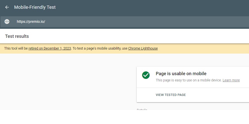
Source: search.google.com
If the test reveals that your website is usable on mobile devices, you are good to go. On the other hand, if the test results are negative, and you keep hearing negative comments from your website visitors, it’s time to make some changes.
2. Avoid Overusing Popups
Popups are great for promoting your enticing offers when used in the right way. When over-used in advertisements, they may be annoying to your website users.
Having said that, some website owners tend to go overboard with their pop-ups. They implement an aggressive strategy and push opt-ins to encourage users to:
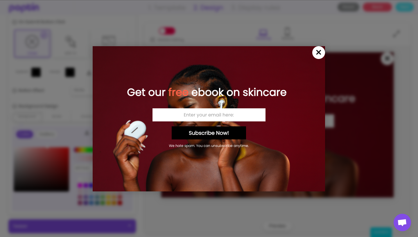
Image source: www.poptin.com
- Subscribe to a newsletter
- Get a discount coupon
- Check the latest updates
Such and other calls to action generally provide value, but if they become too invasive, they hinder one’s mobile browsing experience. And not just in the sense that the popups get in the way.
If ads take a decent amount of time to load on a desktop, imagine how much bigger the issue is on smartphones and tablets with less processing power.
The solution isn’t necessarily to get rid of all the popups and other ads. Instead, you should consider implementing mobile-friendly popups that make it easy to navigate pages on mobiles.
3. Find a Reliable Hosting Provider
A reliable hosting provider plays a prominent role in the user browsing experience. Treat it as a fundamental part of a website’s well-being.
One rule of thumb is to avoid shared hosting plans. In case you end up on the same plan with websites that receive large traffic spikes, it will affect you. The problem could manifest in as much as taking the entire website down.
Shared hosting is an attractive proposition because it’s cheap. Yet, by trying to save money, you lose in the long run.
Don’t look for a cheap solution if you care about your website. Opt for a dedicated hosting provider that offers you:
- At least 99.99% uptime
- Security features
- Customer support
- Backup options
Keep in mind that a reliable hosting provider is not just for mobile devices but also for those visitors who are using desktop computers.
4. Use Relevant Plugins and Choose a Friendly Theme
Plugins and themes shape a WordPress site. One thing to get out of the way early about plugins, though, is that you shouldn’t install too many.
For instance, you may need a live chat app to streamline customer service on your website, or form builder plugin to collect email addresses.
Some WP developers want to add as many features to the website as possible. However, they fail to weigh the cons by focusing too much on the positives.
Each plugin adds to an already complicated process. Some downsides include:
- Risk for security breach
- Potential conflict
- Poor performance and stressful maintenance
Now, as far as mobile plugins go, you can opt for a solution that repurposes the website’s content and makes it easy to navigate on smartphones or tablets.
In tandem with plugins, you should also look for a mobile-friendly theme. These days, most WP theme developers understand how big the mobile market is. As such, they want to make sure that the theme is suitable for mobile browsing.
To be sure that the theme is mobile-friendly, look for some telltale signs. For instance, a theme should come with a built-in customizer for the website’s headers and the mobile view option.
Other themes let you select multiple setups, including one for smartphones and tablets. And then, there are WP themes that come with a disclaimer or a name that clearly indicates that they are mobile-friendly.
One last thing to note about plugins and themes is taking the necessary time to research and find the best available options.
Read through as many reviews as you can and determine which solutions are the best for you. If possible, seek personal advice from people you know and trust. Those are worth more than random online reviews.
And remember that you can always test different themes and plugins, especially if they are free. Your first few choices might not cut it, but you are bound to find a setup that works out in the end.
5. Consider Media Files on the Website
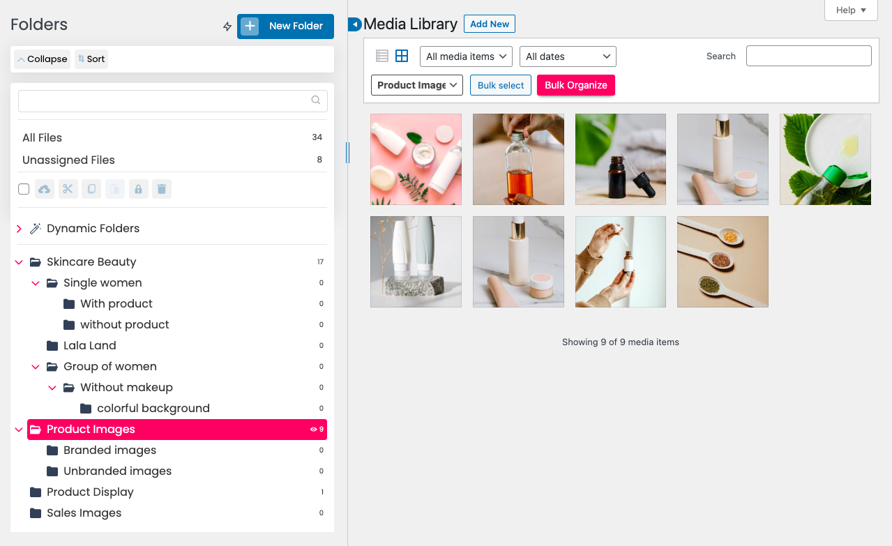
Source: Premio.io
Depending on what kind of a WordPress website you have, it could be cluttered with a plethora of different media files.
It’s common to use visuals to enrich the website’s content. An average person doesn’t have the attention span to read through walls of text. Publishers focus on:
- Static images or GIFs
- Videos
- Infographics
Unfortunately, it’s easy to lose track of how many different media files your WordPress website holds. Once the limit is reached, each additional piece of media adds to the issue.
Of course, it’s not always just random images that cause problems. If you have a large background image for your website, keep in mind that it does not translate as well into mobiles as it does into desktops.
Media should be responsive on mobile devices. It might take a while to go through all the uploaded images and other files, but you have to thoroughly check and make adjustments when necessary.
For example, if you have a website that uploads podcasts, converting WAV to MP3 on Mac or another device could help with compatibility, quality, and size.
Another example is image resizing. 640 x 320 px is usually enough for mobile viewing. Compressing images does wonders, too. You can reduce the size multiple times without sacrificing the quality.
The correct file format is imperative, too. These days, more and more websites stick to WebP. It’s the go-to, not just for mobiles. Desktop devices support the format, too. If you tried downloading images from various websites directly, you must have encountered WebP.
Understand that if the media files on your WordPress site get out of control, they will do significant damage.
To solve this problem, you can organise your files with Premio’s Folders plugin.
Search engines detect slow loading speed, penalizing the site, for one. And let’s not forget how sluggish performances leave mobile users unhappy, forcing them to stop browsing the site.
6. Enable Mobile Caching
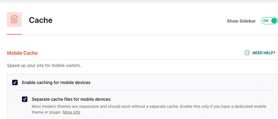
Source: wp-rocket.me
Mobile caching is an easy feature to miss, particularly among those who are not well-versed in WordPress intricacies.
The technique reduces the load on an application and its servers. Caches store data locally and help:
- Reduce bandwidth usage
- Improve the device’s battery life
- Minimize network perceived lag
Take this as an example. You visit a new website for the first time, and it takes a while for the device to load everything up. Images and other elements get stored on the device’s browser cache.
The next time you visit the same site, it will not take as long to load everything, which ultimately leads to a better experience.
Generally, it is recommended to clear the device cache on a regular basis, but most users don’t bother with it. As for those who do, it will only take two consecutive visits to the same website for the cache to be in effect again.
Similar to other WordPress optimization options, there’s also a dedicated plugin to enable mobile cache on your website.
7. Eliminate Redundant JS and CSS

Source: wordpress.org
Render-blocking resources is another maintenance step that should lead to an improved mobile browsing experience.
PageSpeedInsights (PSI) is a tool available for WordPress users. It indicates which resources are in the way. Too much unnecessary JS and CSS code prevents browsers from rendering the information. Or rather, the redundancies require their own rendering time, slowing everything down.
In layman’s terms, it’s the process of dictating what the browser should prioritize when loading the website’s information.
Note, though, that working with code requires certain qualifications. The person who knows what they are doing should be the one to clear the redundancies if they are doing it manually.
As an alternative, it should not come as a surprise that you can also find a plugin to eliminate redundant JS and CSS code.
Wrapping Up
To sum everything up, there are a few methods that make the mobile browsing experience on WordPress websites better.
It’s up to you how much you want to do to make it easier for visitors. Some maintenance tasks require a lot of time, while others are pretty straightforward and can be completed with the help of plugins.
Still, the general idea is that it should be a consistent effort from your side. After all, issues accumulate over time.