A mobile-responsive website isn’t just a little extra thing you can do for your website. It’s now a requirement for many mobile users these days.
Want to improve your WordPress website so mobile users can easily navigate it? Then, consider installing some of these mobile-friendly WordPress plugins for your website.
Why is it essential for a website to be mobile-friendly?
Before we cover some WordPress plugins that can help you be more eco-friendly, let’s first cover what it is.
Mobile-friendliness is the ability of a website to be easily viewed and navigated on mobile devices. It is essential for any website as it ensures that users can access the content regardless of their device or platform.
These websites are more user-friendly as they are for different screen sizes and resolutions. This feature makes it easier for users to access the information they need without zooming in or out.
Furthermore, mobile-friendly websites also help improve search engine rankings and provide a better overall user experience. As such, if you want to target mobile users for your campaigns, you start by ensuring that your website is easy to view as a mobile user first.
If you don’t have a mobile-friendly website, it can cause people to leave your website once they get there. Since they can’t reasonably read or see the content on your website simply because they don’t have a suitable device, they don’t want to continue using your website. Therefore, make sure that you have a mobile-friendly website.
Now that you know what mobile-friendliness is, its importance, and its benefits, it’s time to cover the plugins that will help you be more mobile-friendly.
1. Superfly
Superfly is one plugin you might be interested in adding to your WordPress website. Superfly is a plugin that helps ensure that your website navigation menu is mobile-friendly no matter what.
If you need to modify your website’s navigation menus as well, then there will be many ways for you to do that with the help of this plugin.
A mobile-friendly website menu navigation makes it easier for users to find what they are looking for on your site and helps them have a better user experience.
Furthermore, having a well-designed and organized website menu navigation allows users to quickly navigate through the different sections of your site without any hassle. This change ultimately leads to higher conversion rates and more satisfied customers.
When you have a great navigation menu, your other web pages outside of your homepage will get more organic traffic through it. You’ll send your web visitors to the right places, and the areas they’re looking for are much more accessible. That’s why you must use Superfly if you want an easy way to make your navigation menu mobile-friendly.
2. WPTouch
If you are the only one managing your website and have established one, then it’s a significant accomplishment. However, you need to ensure that you don’t neglect to create a mobile-friendly version of your website. Again, otherwise, you’re going to miss out on your web visitors who use different devices.
When you don’t have experience turning a website into a more mobile-adaptive site, then it helps to install a plugin instead. That way, you don’t have to worry too much about the setup, especially if you don’t know where to start. With that said, the plugin you might want to start with that can help you with that would be WPTouch.
It instantly creates a mobile-adapted website theme to get things started without worrying about mobile users. What’s also great about that is that the theme will pass Google’s Mobile Test, so you’re sure it is good to view for other devices.
If you want more customizability for whatever theme it generates, consider using the WPTouch Pro.
3. SeedProd
For people who want to build their website but don’t know how to make it seem like what they want it to be, a website builder can be a big help. One kind of website builder that can help you with your WordPress website is SeedProd.
SeedProd is a website builder you drag and drop elements onto to build whatever website you want. It’s excellent for making any landing page you want on your website.
With the help of a website builder, you can easily create a mobile-friendly website that looks great on all devices. Website builders are user-friendly tools that allow you to quickly and easily create a professional website without any coding knowledge.
Website builders provide numerous benefits, such as increased mobile-friendliness, improved search engine optimization (SEO), and faster loading times. Additionally, they are cost-effective solutions that save time and money for businesses of all sizes.
If you don’t have a functional website running just yet, consider getting SeedProd to help you.
4. Jetpack
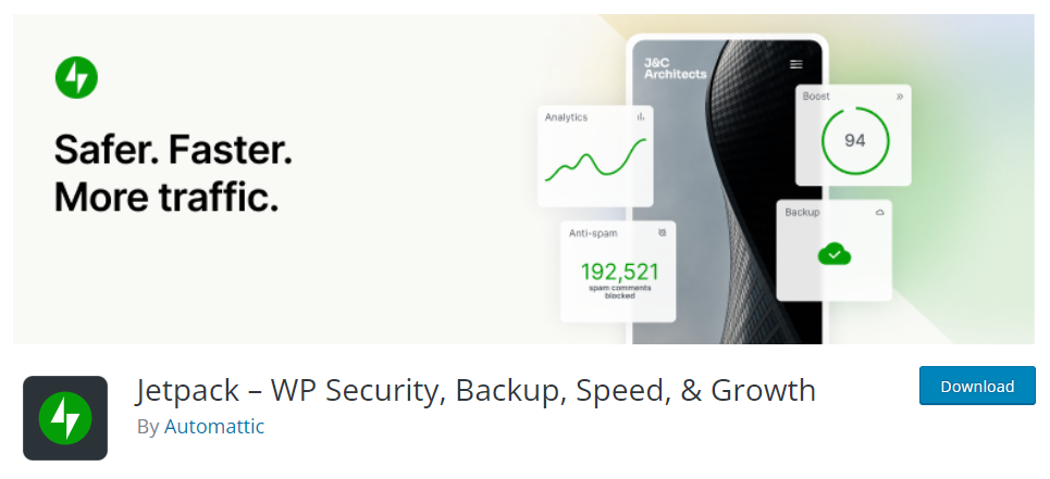
When working on your WordPress website, you should pay attention to the overall performance, speed, and security. No matter what device someone uses to view your website, they should have the optimal experience as much as possible. That’s where the plugin called Jetpack comes in to help you.
Jetpack has a variety of features that can help your website’s performance:
- 24/7 WordPress website security to protect your online store from a data breach
- Content delivery network for image optimization
- Lazy loading abilities, even on mobile
- Data backups
There are more than the ones listed above that help your website perform faster. The great thing about a fast-loading website is that more mobile users will be willing to stay on your website for longer.
Regardless of where your website visitor comes from, the best loading speed for your website should be between two to three seconds. You would be one of the better versions of many websites when it comes to loading speed if your website loads faster than three seconds. Therefore, investing in plugins that help with the loading speed, like Jetpack, can help.
5. AMP for WP
AMP stands for Accelerated Mobile Pages, a way to optimize your web pages further to ensure they’re as fast as possible for mobile users. What’s excellent about AMPs is that Google encourages these pages for many websites so that your websites are easy to consume for users.
When you have AMPs, Google will encourage that, so it will also be great for your SEO. Therefore, consider installing AMP for WP first since it has no downsides. Not only will it help with SEO and mobile-friendliness, but it’s also free, so there are no expenses for them plus, it can help your website rank higher.
Do note that the AMP plugin itself will not give you customizability for your web pages, but they ensure that the basics and the core of your webpage are mobile-friendly. You should add other things before you can get the customizability you want.
6. WordPress Mobile Pack
One way to make your website more mobile-friendly is by turning it into an app. After all, people who make apps already ensure it works well for phones. However, that is easier said than done since making an app is a lot of work. If you want to turn your website based on content into an app, then consider installing the WordPress Mobile Pack plugin.
This plugin helps your website transform into a mobile app so that it’s easier to go through than a usual website on the phone.
What’s great about WordPress Mobile Pack is that you can choose from many themes, even with the accessible version of this plugin. Plus, you don’t have to know a lot about coding to be able to start your app, and they have customer support to help you with their plugin.
7. WP Mobile Menu
If you want more options for plugins that help you create a responsive navigation menu, then WP Mobile Menu is another plugin worth trying.
With the help of WP Mobile Menu, you can create and customize your navigational menu for all sorts of things. It can include your branding and other imagery you would want your menu to have.
You can get their premium version which is better if you want to include e-commerce functionalities to your website, even in the mobile version.
Their customer support also comes for free, but they claim that their premium support is even better, which is good if you encounter issues with their premium plugin.
The plugin is pretty intuitive so that you can set up a better navigational menu for your responsive website in no time, so try it out if that’s what you need.
8. Smush
You have to keep an eye on many things in a website when working on better website mobile responsiveness. One of them would be the loading speed.
The loading speed and other factors affect it that you should be mindful of, including the images on your website. If you have a lot of pictures on your site, it can affect how fast your site loads if you’re not careful.
That’s why one of the most important aspects of making your website mobile-friendly is to reduce the size of your image files.
This step will help improve loading times and make your website more accessible to users on mobile devices. By lowering the size of your image files, you can create a better user experience and ensure your website is accessible easily on any device. One way to do that is by using a plugin like Smush.
Smush is there to lower the overall file size that your images occupy as much as possible without compromising the look of the picture. That way, your site can load fast, which you want to have if you wish to have a mobile-friendly website. It’s just one of the many plugins that improve your website performance.
9. Max Mega Menu
Max Mega Menu is another trusted plugin for many people regarding improved navigational menus for their mobile websites.
Max Mega Menu helps you restyle your menu and modify it to include whatever plugin you need so that you can improve how it functions. Of course, this also enables you to ensure that your navigational menu is okay when a mobile user views it.
Their plugin comes in both a free and premium version, so if you want to increase the number of functions it has, consider getting a premium plugin version.
Conclusion
These plugins all help make your website more responsive for mobile users in one way or another. Whether by improving loading speed or adding better website features, your website can create a more improved user experience for any user, no matter what gadget they may be using.
Author’s Bio: Kenneth Sytian is the Owner and CEO of Sytian Productions Web Developer Philippines. He has been designing websites and developing web apps for more than a decade. He is the driving force behind the company and influencer in the industry of web design and development in the Philippines.