User experience is everything when it comes to creating a functional web design. One important factor that can have a significant impact on user experience is a sticky menu or navigation bar.
These simple yet powerful features can make your website easier to use by allowing visitors to access navigation options easily. This can improve user engagement and keep visitors on your website longer.
In this blog, we’ll explore the details of creating a sticky menu that’ll help you improve your website’s usability and user engagement.
Let’s dive in.
What is a Sticky Navbar?
A sticky menu is a fixed navigation menu on a webpage. It remains visible and in the same position as the user scrolls down the page or moves around on your site.
Fixed navigation bars — or “sticky navbars” are today an integral part of web design.
Benefits of Sticky Menu
Sticky menus offer several benefits, including:
1. Improved User Experience
Sticky menus make it easier for users to navigate your site, which can lead to increased engagement, cooperation, and satisfaction.
According to various studies and insights from books on sales strategy, this unassuming design element can profoundly impact visitor behavior.
As users scroll up and down a page, a sticky menu provides a constant, reassuring presence, bolstering their confidence and sense of control. This offers a seamless experience, leading to increased conversion rates and sales.
2. Reduced Bounce Rate
A sticky navbar allows users to smoothly scroll other pages on your website, even if they have scrolled down a long page.
This action can help to reduce the chance that they’ll become frustrated and leave your website without finding the information they need. The result? A lower bounce rate, or the percentage of visitors who leave a website after viewing only one page.
3. Increased Conversions
Sticky menus can increase conversions by making it easy for users to take action, like signing up for your newsletter or making a purchase.
Plus, when you integrate it into a sales enablement strategy, a sticky navbar can offer insights into user behavior and preferences. It unlocks insights on optimizing menu items based on the most frequently visited pages or user interactions.
How to Implement a Sticky Header
Have you ever gotten lost on a website trying to find the information you need?
Sticky menus can help solve this problem by constantly showing your most important navigation options, no matter where you are on the page.
Here’s how to implement sticky menus on your site:
- Decide which elements of your navigation menu will be included in the sticky navbar. These usually consist of the most essential elements, such as the logo, homepage links, and any categories or pages.
- Create a sticky menu with Premio’s Sticky Bar plugin or using HTML and CSS code. This code must be inserted into your website’s existing HTML.
- Test the sticky navbar in different web browsers to ensure it works correctly and displays consistently across devices.
- Optimize the sticky header for performance. Try minifying the HTML and CSS, reducing image size and caching usage, and other performance optimization techniques.
- Implementing sticky menus is a simple process that can have a significant impact on the user experience of your website.
By following these simple steps, you can ensure that your sticky header works well and looks great on all devices.
Best Practices for Creating a Sticky Menu
There are different use cases for a sticky menu, but it’s important to follow best practices to ensure it functions well and provides a positive user experience.
Here are five best practices for creating a sticky menu:
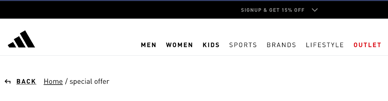
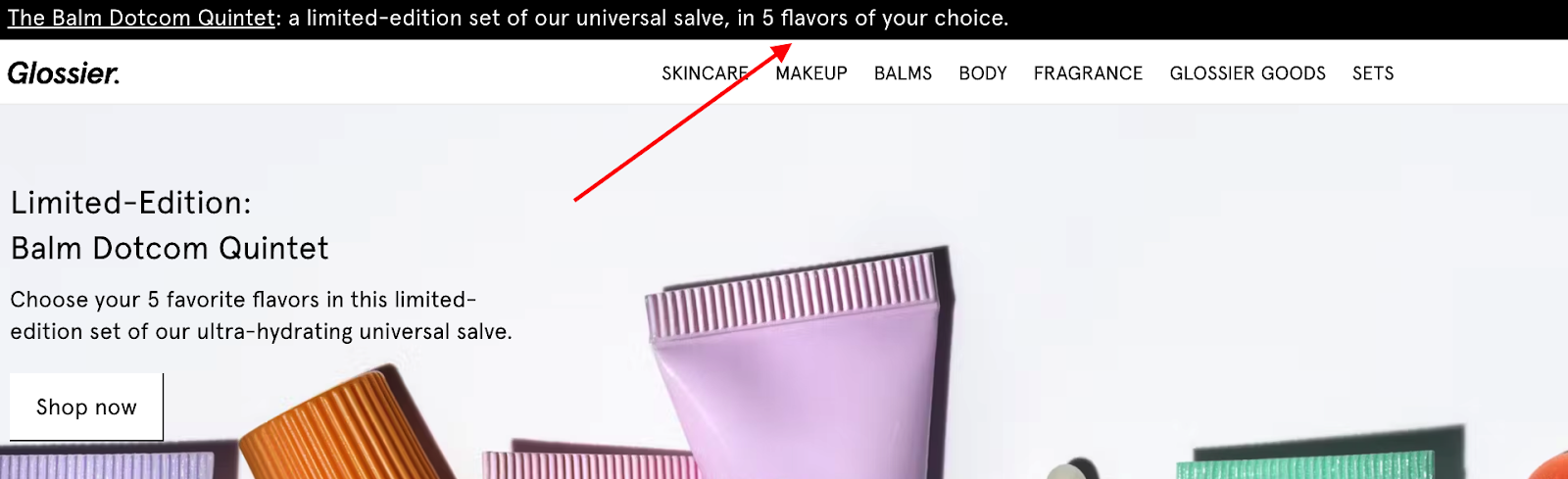
1. Keep it Simple
Sticky menu should be simple and easy to use. Minimize the number of items in your sticky menu and focus on the most important pages or sections of your site.
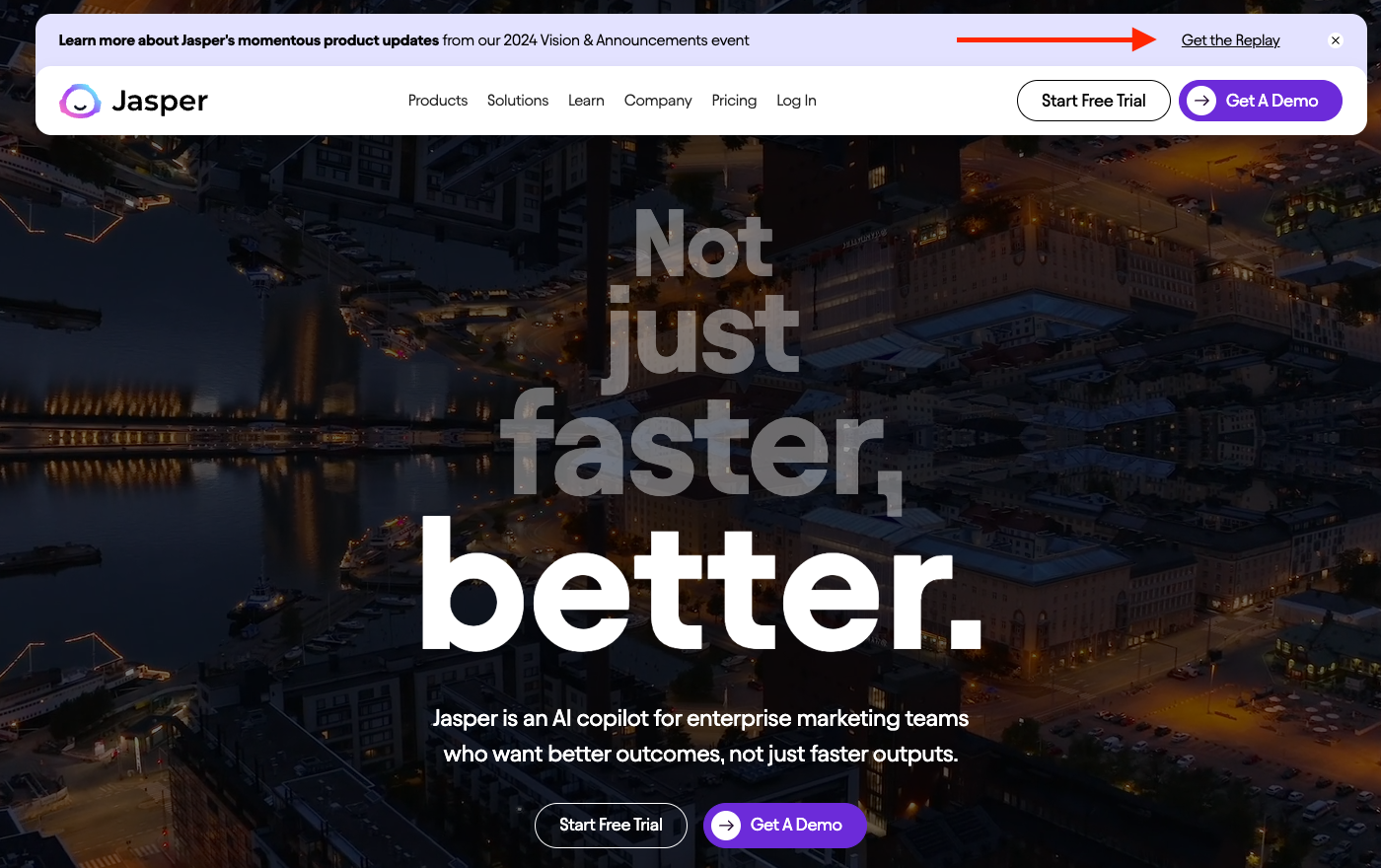
Here’s a great example from Adidas:
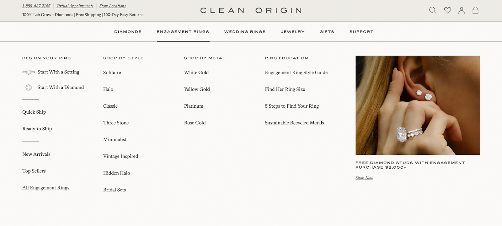
You can also use a drop-down menu or a hamburger menu to avoid clutter on your homepage.
Here’s a great example from Clean Origin, a store specializing in lab-grown diamond engagement rings that leverages drop-down menus to showcase additional jewelry products without causing clutter.
Here are some tips for keeping your sticky header menu simple:
- Only include the most important pages or sections of your website in your sticky menu.
- Use adequate spacing between sticky header menu items.
- Use clear and concise language for your menu items.
- Use a consistent design throughout your sticky menu.
- Avoid using too many colors or fonts.
2. Make the Design Responsive
Your sticky menu should have a responsive design and display correctly on all devices.
In other words, size and space your menu appropriately for each device. That way, all menu items must be easy to tap or click.
Look at this example from the Search Engine Journal. The desktop version of the site shows a fully expanded sticky menu.
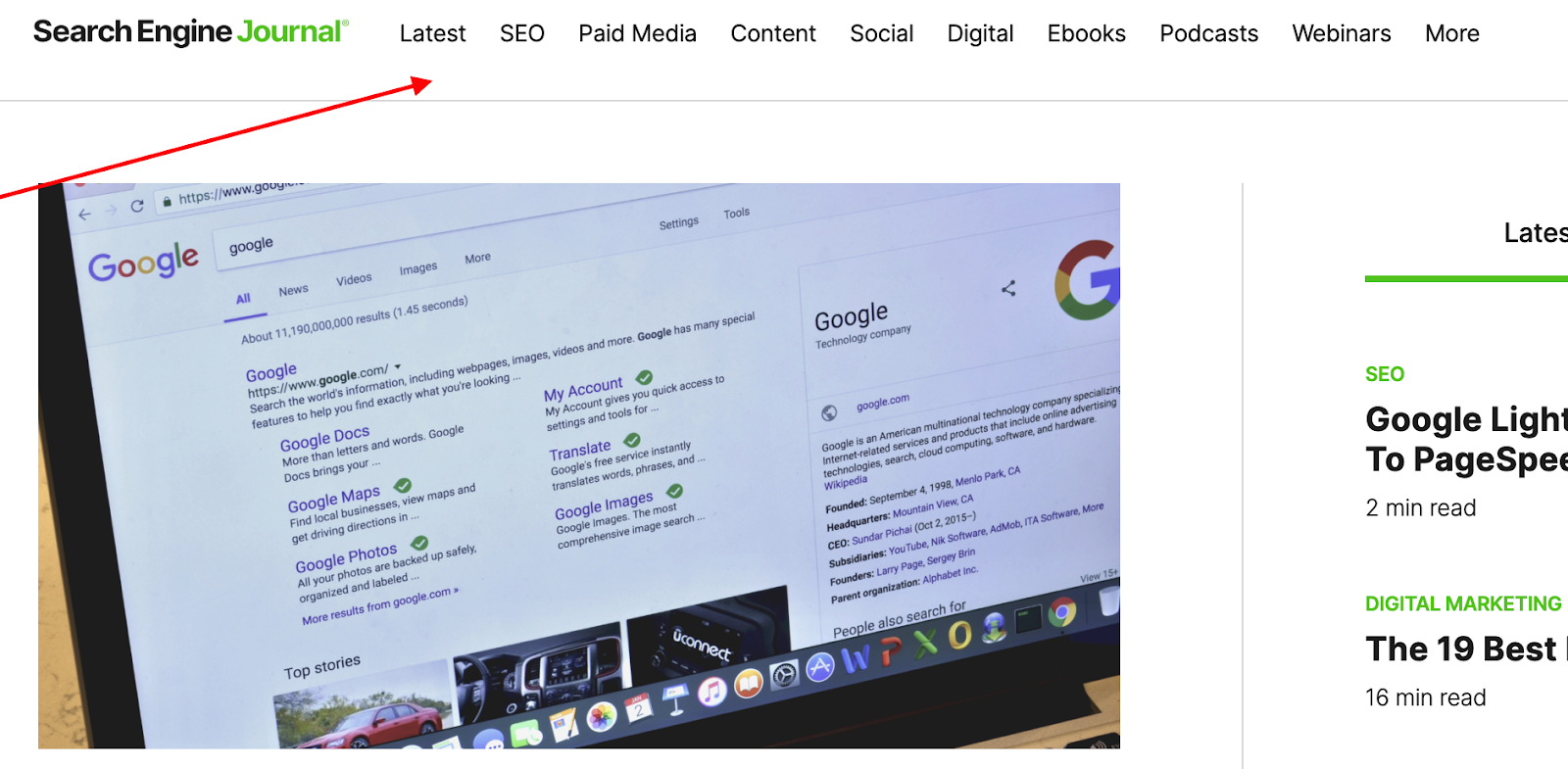
Screenshot by Jugraj Singh
Meanwhile, the mobile version of the site collapses the menu into a hamburger button.

Screenshot by Jugraj Singh
Here are some tips for creating a responsive design for a sticky menu:
- Use CSS media queries to adjust the size, spacing, and visibility of the sticky menu for different devices.
- Use large touch targets and touch fonts for your persistent menu items on mobile devices.
- Use the hamburger menu to hide less important menu items on smaller screens.
3. Offer Smooth Transitions
Your sticky menu should transition smoothly between fixed and unfixed states. A smooth transition will help improve your website’s user experience and create a more polished look.
Here are some tips for creating smooth transitions for your sticky menus:
- Use CSS animations to transition your sticky menu between fixed and non-fixed states.
- Use short transition durations so that the transition is noticeable but not distracting.
- Use a smooth easing function to create natural-looking transitions.
4. Make it Easily Accessible
Your sticky menu should be accessible to all users, including those with disabilities. This means the menu must be easy to navigate using the keyboard, and the text must be large enough and have enough contrast to be readable.
Here are some tips for making your sticky menus accessible:
- Provide alt text for images or other non-text elements in your sticky menu.
- Avoid using images or other non-text elements in your sticky menu.
- Use large fonts and high-contrast text for your sticky menu items.
- Use keyboard-accessible navigation for your sticky menu.
If you aren’t sure if your website is accessible, run your site through a website accessibility checker for the best results.
5. Optimize for Performance
Your sticky menu should load quickly. In other words, it shouldn’t negatively impact the overall performance of your site.
Follow these simple tips to optimize the performance of your sticky menu:
- Avoid using unnecessary images or other resource-intensive elements in your sticky menu.
- Use a caching plugin to improve your sticky menu loading speed.
- Use lightweight JavaScript and CSS code for your sticky menu.
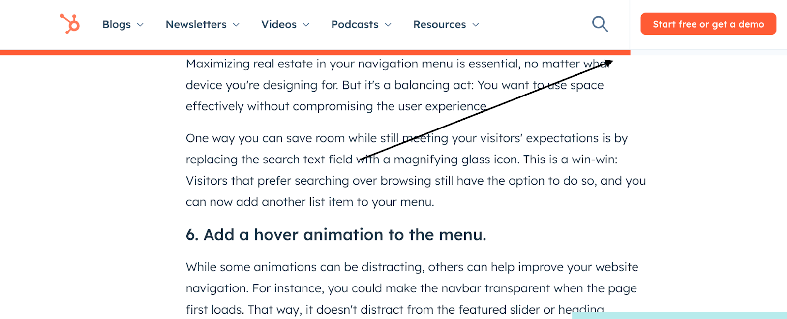
6. Add a Scroll Indicator
The scroll indicator is a visual element that tells users how far they have scrolled on a page.
It’s a helpful tool for users who want to quickly navigate back to the top of the page or to a specific part of the page.
Use these best practices when adding scroll indicators to your sticky navigation bar:
- Make the scroll indicator interactive so users can click or tap it to return to the top of the page quickly.
- Use a progress bar or other visual element to show users how far they’ve scrolled on a page.
- Place the scroll indicator in a visible location in your sticky menu.
7 Tips for Boosting User Engagement and Navigation with Sticky Navbar
Here are seven simple tips to employ sticky menus to improve user engagement and navigation on your website.
#Tip 1: Use Sticky Menus Wisely
Sticky menus can be a great way to improve the user experience of your website, but it’s important to use them sparingly.
Too many sticky menus can clutter your screen and make it difficult for users to focus on the content.
#Tip 2: Keep it Simple and Easy to Use
Your sticky menu should be easy to read and navigate. Use clear, concise labels, and make sure the buttons are large enough to press or click.
Only include the most important links, such as your homepage, contact page, and product pages.
#Tip 3: Make Sure it Functions Well Across Devices
Your sticky menu should look and function well on all devices, including desktops, laptops, tablets, and smartphones.
#Tip 4: Highlight Important Calls To Action
Place a call-to-action button in your sticky menu to encourage users to take the desired action, such as signing up for your newsletter or making a purchase.
#Tip 5: Promote New Content and Features
When you have new content or features to promote, add links to your sticky menus so users can easily find them.
#Tip 6: Easy Return to the Top of your Page
Add a “Return to top” button to your sticky menu so users can easily return to the top of your page without having to scroll all the way down.
#Tip 7: Don’t Obstruct the Content
Don’t use a sticky navbar on pages where it’d block the content.
For example, avoid using a sticky navbar on product or checkout pages, which could make it hard for users to see the products or finish their purchase.
Improve Your Website User Experience With A Sticky Navbar
Sticky menus can improve the visitor experience on your site by staying visible and accessible no matter how far they scroll. Take some time to create a sticky menu that’ll enhance your site’s main navigation.
Whether you use CSS, a Sticky Bar plugin, or a theme with a built-in navigation bar, make sure to follow menu best practices to offer a seamless experience and increase sales and conversions.
Author’s Bio: Jugraj Singh is a freelance content and copywriter from Delhi, India who’s great at writing compelling content that converts. When not writing, you can find him reading thoughtful books and engaging in socio-cultural discussions, which fuels his creativity.