
So, your business has a great website, and you have a great team behind it. You’ve spent ages getting things right and crafting a finely-tuned plan, but no one is buying what you’re selling. You have many visitors to your website, so that’s not the problem. The issue is they’re not adding anything to their carts or going to the checkout.
Turning a visitor into a paying customer requires you to take action by including a call to action (CTA). Not having one is like not having a till at a supermarket. The best part? Adding one doesn’t require a complicated sales training technique that takes ages to teach.
Here’s how to use CTAs to grow your business.
What is a Call to Action?
A call to action (CTA) is a customer prompt – either a word, phrase, or sentence – to encourage them to make a purchase. It should be persuasive, clear, and well written so it’s evident what you want the customer to do. It’s good practice to think about size, design, layout, and impact when you craft a CTA.
Five Common Types of CTAs
Whenever you create a piece of content – a blog, social media post, or podcast – you should include a CTA. The most common types are:
- Webpage buttons
- Opt-in campaign buttons
- Anchor text in blog posts
- Buttons or text in emails
- Text in social media posts
Here are eight call-to-action tips to get those CTAs right and make them work for you.
1. Design Your CTAs
It’s not enough to include a call to action – it needs to be designed well to catch people’s attention. We recommend using colors. These make a big difference if you want a customer to convert. A well-designed CTA uses bright colors and ones that contrast with each other to stand out from the background.
There’s no definitive answer as to which combination is the most effective. You must design and test various options to determine which ones work best. Many factors will have an influence: your website, brand, other eye-catching design elements, etc.
Make sure you choose colors for your CTA that fit with your brand’s overall style and feel and that contrast with those on the rest of the page. Don’t forget to use white space, as this will make your CTA stand out.
You can frame the CTA to create more of a contrast. Pay attention to its size too. It needs to fit the page. Don’t make it so small it’s insignificant or so large it’s overwhelming.
Remember mobile users and optimize your call to action button for those viewing on their smartphone.
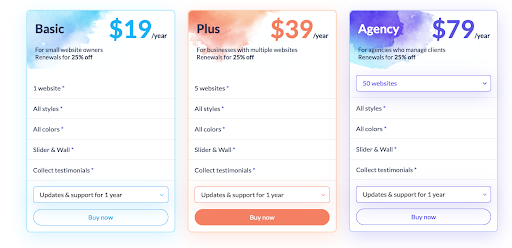
The images above are great examples of how to create a simple CTA. The colors stand out from the white background, and each price plan has a unique CTA so as not to cause confusion.
2. Use Exciting Language
Memorable CTAs use actionable words that let the person know exactly what they should do next. For example:
Join our mailing list for mind-blowing special offers!
This CTA gives the reader instruction and is motivational and encouraging.
Sometimes, it can be hard to think of the right phrasing, but remember the most powerful words create emotional responses, which are more likely to make people react to your message.
Examples of words that evoke emotion include:
- Sensational
- Mind-blowing
- Wondrous
- Remarkable
- Epic
Try to grab your audience’s attention through your phrasing. Play with the power of words and enchant your reader into wanting to click that CTA button. Don’t be afraid to use figures of speech and popular phrases to make your writing look more enthusiastic and lively.
If you choose normal words such as “buy”, “submit”, and “shop now”, you’re less likely to engage. You need to compel the reader to take action; don’t expect them to passively click your CTA without first being pointed in the right direction.

Asos has nailed the CTA above. Not only is the design effective, but the copy is funny, actionable, and contains a play on words – precisely what you’re looking to replicate with your own calls to action.
3. Create a Sense of Urgency
Urgency makes people act. Give them a deadline of some sort. By indicating a deadline for a product or service, you make readers more likely to buy as they feel they’ll be missing out if they don’t.
You could use words like “now”, “hurry”, “quickly”, or “limited edition”, or phrases like:
- “Buy now. Only two items left in stock.”
- “Reserve your seat now.”
- “Sale ends soon. Shop today.”
- “Order your free copy now.”

The advert above is a great example. When people see it and realize they only have five hours to act, they’re likely to grab their credit cards and purchase the product immediately. That’s because urgency increases conversions.
Another great technique in this advert is anchoring. People rely on the first piece of information they’re given and then evaluate any that comes after based on this. So, when they see £15.99 followed by £59.99, they think the first price is extremely cheap and the second expensive. The initial price sets the scene and is viewed as an excellent deal. This method is an alternative to using coupon codes on your website.
4. Address Customers Personally
The personal touch builds trust. Potential customers want the truth clearly presented to them, and they’re more likely to believe what you’re saying if you address their pain points and show an understanding of their needs and wants.
For example, a content website can only provide knowledgeable information and guides on a specific topic. So the CTA should be about what you can help with. Sleepjunkie, a review site on sleep tips and mattresses, uses a similar CTA to help customers, which would lead to conversion.
Don’t try to pull the wool over their eyes and manipulate them into buying something from you; personalize your campaigns so you’re sending offers that have value to them. Use your CTA to explain the benefits of purchasing and be clear about what will happen in the next steps.
Your customers want to be fairly treated, so don’t use the CTA to misrepresent your offer. If a customer feels you’ve been truthful with them, they’re more likely to return again. Long-lasting relationships are where real value lays.
You could even use automated email marketing to send offers and calls to action that are personally addressed to them.
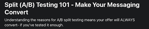
5. Test Your Calls to Action
You think you’ve created a great CTA, but it’s not enough to have a feeling. You need to know it provides a great customer experience.
It’s difficult to write a good CTA, but once you think you’ve succeeded, you want to know it’s right. So, how do you find out? You ask for the data. The best way to do this is via split testing. You can experiment with color and size, text, text links, form, page design, and CTA placement. Start with one design and create an A/B test to trial it.
Make a change to one of the elements and run the test a second time. Once you’re done, pick the option with the highest conversion rate. Change one more element and repeat ad Infinitum or until you’re happy with the result.
Why alter one element at a time? Because you’ll be able to tell which factors are resonating with your audience and which aren’t.
Split testing is an essential part of creating the perfect CTA. In addition to techniques such as using content localization to elevate your customer experience, it’s a great way to test customer engagement.
6. Give Customers Proof
Humans are social animals. If we don’t know what to do, we look to those around us for validation or confirmation. If these people were in the same situation, what would they do?

In the image above, one product is shown to be a ‘best seller’, which means many other people have bought it, so it must be good.
Also beneath these products, you can see the average star rating. This shows the visitor what previous customers thought and validates that the product is worthwhile.
This type of surrounding information makes customers feel more confident about clicking on the CTA i.e. “Get it tomorrow”.
7. Show You’re Different
Give people a little help by communicating why they should buy your product or service. What’s your unique selling point? What makes you stand out from the crowd?


For example, Triodos is a sustainable bank. This is pretty clear from its website. It shows customers its business model is different, as well as the fact it’s recognized for its efforts through its accreditations. The CTA is simple – ’Switch now’.
You could go one step further and give customers more information about your cause – perhaps a lead magnet to help convert them. Use a call to action, such as “download now” or “read more” to encourage them to access these free resources.
8. Experiment with Different Types of CTA
You’ll likely have many different visitors to your webpage i.e. different ages, personalities, and styles. So, be experimental and find out what works best for various audiences and demographics.
You should use different types of CTA throughout the buyer’s journey. At the beginning stage, “find out more” would probably work best, while at the end, something like “buy now” may be more appropriate. You don’t know until you try, so start experimenting.
Change the CTA’s size, shape, color, language, placement, etc, and see what works. Then talk to people. Which one do they prefer? There is no magic formula, but the more call-to-action tips you try, the better and more effective your CTAs will become.
Isn’t time you put these tips to use to grow your conversion rate and increase your sales?
Author’s Bio
Grace Lau – Director of Growth Content, Dialpad. Grace Lau is the Director of Growth Content at Dialpad, an AI-powered cloud communication platform and PBX system for better and easier team collaboration. She has over 10 years of experience in content writing and strategy.