As consumers, we know how irritating some popup ads can be. As digital marketers, we become blind to the fact that we’re annoying blog readers with disrupting popups, or as Google calls them, “intrusive interstitials.” Ouch!
Now, we’re not suggesting you write off pop ups forever. You might be surprised to know popups are a powerful conversion tool. Studies show that strategically placed popups have a 3.9 percent conversion rate.
We won’t keep boring you with the facts, though. Let’s discuss how to turn blog readers into leads through popups without being penalized by search engines.
Give Blog Readers an Escape
Internet users prefer quick and convenient, with limited interruptions and no forced interactions. That’s why they’re reading an online blog instead of perusing their library or local store’s magazine section.
Therefore, if you’re planning on using a popup that interrupts their reading, you must include an obvious way to close it. If it takes them too long to figure out how to exit the popup, their next step is usually closing the page altogether.
Include a visible X in the top-right corner of your pop up because this is most users’ first instinct. If that’s not an option, place a simple “no, thanks” button at the bottom or allow them to exit by simply clicking outside the popup box.
Choose a Noninvasive and Timely Pop Up
Studies show popups that startle users, force them to interact, and attempt to control their behavior on the page result in a negative user experience. In other words, avoid persistently pesky popups.
There is a wide variety of subtle and easy-to-exit popups that are still compelling. These more discreet popups are better for blogs as most users visit a blog to read and don’t appreciate difficult-to-curb interruptions. Let’s take a look at a few of these noninvasive popup ads.
Scroll-triggered Popup
Scroll popups are excellent for blogs. The popup is activated once readers reach a certain point on the page, usually determined by you. Most digital marketers wait for them to get toward the bottom of the page because it suggests they are interested in the content.
For example, once a blog reader is three-fourths of a way down the page, a popup with a compelling offer will grab their attention. This type of popup is most effective when it offers something similar to what they’re reading, like an ebook, newsletter subscription, or webinar.
Exit-Intent Popup
Exit-intent pop ups make their debut right before users exit the site. This type of popup is one of the least invasive as it allows your blog readers to have a distraction-free visit and fully immerse themself in your brand. However, if you’re going to use this popup, it needs to be noticeable.

Consider casting a shadow over the rest of the page, making it a contrasting color, or adding a sound effect, so it grabs the visitor’s attention quickly before they leave. Exit-intent popups are especially compelling when they offer something that says, “don’t forget me,” like a free resource.
Click-activated Popup
Click-activated popups are another non-intrusive option. They do not distract your blog reader from the content or even require them to close the popup. Click-activated popups only appear when a site visitor freely clicks a link or button that activates it.
Click-activated popups typically redirect your blog readers to a landing page containing an offer or a subscribe form. They are best used for this purpose as the user voluntarily participates in them and is more likely to enter their email.
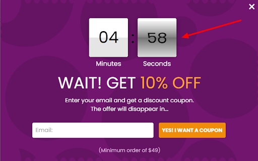
Time-based Popup
Time-based popups are the most aggressive option, aside from an entry popup, which is not mentioned here. A time-based popup appears once a user is on the page for a certain amount of time, usually after 60 seconds.
The logic is that if a viewer is on the site for over a minute, they probably like what they see. Because time-activated popups greet your blog readers so soon, they perform best when complete with an offer difficult to deny, such as a complimentary quiz and results or ebook related to your content.
Include a Compelling Call to Action
Regardless of the popup style you choose, it must contain a coercive call to action (CTA) to be successful. Without one, your blog readers will likely exit the popup, never giving it a second thought.
Many digital marketing experts also recommend making the offer without strings attached since most users do not convert on their first site visit. Consider including a checkbox that allows them to approve or deny receiving updates from your online business.

Additionally, the offer should be accessible through a button with specific language, like: subscribe here, save now, sign up, try for free, learn more, and so on.
The type of CTA you include depends on your brand and marketing goals. We’ve listed a few hard-to-deny deals below.
- A new-user discount
- A free trial
- A free template download
- A discounted or free consultation
- A free ebook, webinar, or case study.
- A free quiz with evaluative results
- A podcast or newsletter subscription
We get it—giving out free stuff isn’t sustainable. Rest assured, that is not what we’re recommending. The good you are selling is valuable and should be exchanged as such.
With that said, offering your blog readers something small for their visit is just a matter of good customer acquisition tactics and a sure way to gain leads worth having.
Create an Attractive Design
As minuscule as it may seem, a significant portion of your success rests upon the design of your popup. Studies show that users judge a website after viewing it for a mere one-twentieth of a second.
Hence the reason successful digital designers always consider color psychology or how specific colors affect human behavior. With a small amount of research, you can create an appealing popup design.

Multiple case studies credit some color schemes for positively impacting consumer behavior. For instance, red buttons following a CTA are wildly successful. In addition to color schemes, research shows using the right images also increases engagement.
However, don’t expect to find the perfect popup design right off the bat. Finding the right one will require trial and error, or what we call A/B tests. Try using the same popup with two different color schemes and button colors, then examine which one performs the best.
Make Pop Ups Mobile Friendly
Popups on a smaller screen may come across as rude and pushy interruptions.
Google views them this way too! The search engine was actually referring to mobile popups when they coined the term “intrusive interstitials.”
Google strives to improve user experience. Therefore, they will weaken your ranking if your mobile site includes any of the following popup issues:
- Using a popup that hides the main content at any point in a user’s experience.
- Using a popup, the user has to exit out to view the main content.
- Using a standalone popup close to the same size as the above-the-fold portion of the page, with the main content inlined beneath.
Not only will this lessen your chances of ranking on Google, but it will also irritate your mobile visitors. Luckily, most popup tools have an option to omit popups from mobile devices or make them mobile-friendly by only displaying them as a very small portion at the bottom or top of the page.
If your tool does not offer either one of these alternatives, our best suggestion is to find another popup builder.
Other Things to Consider
- Don’t ask for too much information. An email and a name, if necessary, should suffice. Most users, especially new ones, are not willing to enter their life secrets into an online subscribe form even if the offer is good. Remember—internet users expect speed.
- Maintain relevance. Don’t use a single popup across your entire site. For example, if someone is reading your blog, they’ll probably be interested in signing up for your newsletter. On the contrary, someone browsing your products isn’t as interested in your newsletter as they are in a fifteen percent discount.
- Don’t be too persistent. Consider attaching cookies to your visitors’ machines, so repeat visitors don’t grow annoyed at the same popup.
- Offset your live chat box. It is overwhelming to enter a site and immediately be bombarded with popups and chatbots complete with sound effects. If you’re going to add a popup to the page, consider disabling the chatbot or prolonging the time between them.
Final Thoughts
Despite the negative connotation surrounding pop ups, their high conversion rates establish them as an excellent tool when used strategically.
We leave you with this–Don’t be afraid to use pop ups. More often than not, first-time visitors expect something special. In a market that’s rapidly turning digital, how could they not?
There will always be viewers uninterested in your offer, but you need not fear them either! Stick to this guide, and at the end of it, you’ll have a noninvasive popup that won’t hinder your site’s traffic.
If you want a subtle way to increase conversions, you can also consider Premio’s Subscribe Forms. Seamlessly turn your readers into subscribers and integrate the form directly into your email marketing software.