There are a lot of elements to consider when you’re designing a website. You want to have quality content and engaging images.
But you can’t discount the importance of color. The right color palette can tell a story so strong, you don’t need to rely on words or images.
Color has the power to make people feel emotions. It also conveys a sense of your business before the audience reads a word on the screen.
The Role of Color in Web Design
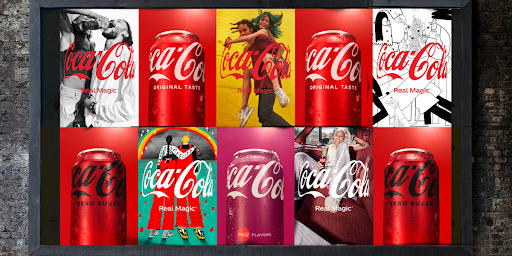
To understand the role of color in web design, think of some big brands you know. Everyone associates certain colors with Coca-Cola, UPS, and Google.
If you ask someone to name colors associated with luxury, they’d probably name black, purple, gold, and silver.
After brainstorming associations with color, you’ll have a stronger idea of what color palettes to use for your next web design. Think of your brand, your mission, and what you want your audience to feel when they see your logo or website.
Brand Identity
Using specific colors in your brand identity ensures people will know about you based on sight alone.
It also helps you pick a color scheme for your website because you have a foundation to build from.
When you’re picking colors for your brand identity, think of how you want the audience to perceive you. If you’re a finance firm, you might not want bright, playful colors. If you make clothes for kids, you probably won’t want a greyscale look.
Color Psychology and Color Meaning
Color can convey emotions and speak to certain audiences, drawing them into your website and what you’re promoting.
- Red is a powerful color used to convey passion, action, and sales.
- Blue promotes peace and serenity.
- Green can represent both nature and finances.
Warm colors are bold, perfect to create energy and inspire action. Cool colors are more calming, but too many cool colors can bring sadness and listlessness to mind if you overdo it.
User Experience
To continue the idea that cool colors can convey sadness, you need to consider the user experience for your website visitors. You can’t know everything about everyone, so you can’t customize the site to please your entire audience.
You can, however, make the layout bold and striking. Make sure text colors contrast with the background, so they don’t struggle to read it.
Aesthetic
Having a general color palette is important for your aesthetic, but you shouldn’t feel restricted by it. You can use additional colors to make specific elements on your website stand out. For example, you can have a cool color scheme but use a warm color on call-to-action buttons.
When it comes to using extra colors to inspire action, there’s no limit.
You want something that fits your overall aesthetic, but you can choose green, orange, red, pink—anything goes. The key here is contrast, so the action button demands attention.
How to Choose a Color Palette for Web Design
Now you have a general understanding of the importance of color. You can use these tips to help choose a color palette for web design.
Consider Your Audience
It’s true that you can’t ensure everyone will see purple as a luxurious color, even though you think of it that way. It’s possible to use a rich purple to get that idea across.
But you need to consider the cultural background of your audience.
A psychological study found that Americans described envy using the colors green, red, and black. Russians associated envy with purple, yellow, and black. Polish people even connected purple to anger and jealousy. If you want to reach a global audience, it’s important to consider all cultural differences.
Beyond that, you can use the basics of color psychology to your advantage. This concept includes fundamental color representations such as:
- Black conveys power, mystery, and sophistication
- White conveys cleanliness, purity, and simplicity
- Red conveys passion, energy, and action
- Blue conveys peace, sincerity, and tranquility
- Yellow conveys warmth, friendliness, and illumination
- Green conveys nature, growth, and money
- Orange conveys creativity, ideas, and alertness
- Purple conveys luxury, royalty, and dignity
Understand Color Theory
Understanding color theory gives you a foundation of knowledge to complement and contrast your colors.
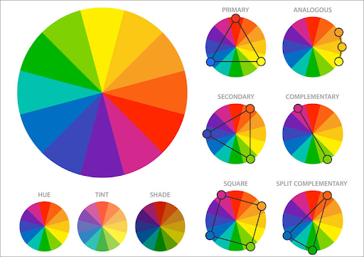
Primary, secondary, and tertiary colors make up the color wheel and give you a broad range of shades to use for web design.
- Primary colors are those that can’t be made by mixing other hues. Red, blue, and yellow are primary colors.
- Secondary colors come from mixing two primary colors. For example, blue and yellow make green. Red and blue make purple. Yellow and red make orange. Green, purple, and orange are secondary colors.
- Tertiary colors are a primary and secondary color mixed together. The primary and secondary colors are next to each other on the color wheel to create a pleasing color, not a mess that loses all definition. Tertiary colors include red-orange, blue-green, blue-violet, and more.
Contrast the Colors
Contrast is important in web design because it ensures each element stands out. As previously mentioned, you don’t want your text to blend into your background.
People will simply close your website and go elsewhere if it’s a struggle to read your verbiage.
It’s not always necessary to use contrast. As you’ll see in the example color palettes, using monochromatic colors, or different shades of the same color can create a stunning look. But contrast helps certain elements stand out. If you use white text on a dark background, the words will pop.
This helps information on your site demand attention.
Keep It Simple
You might think that there are a lot of rules to follow when choosing color palettes for web design. Reading about it is very different than working with the colors, as you’ll see with the example palettes.

Once you start combining colors, you’ll immediately understand how they work together (or not!) and what emotion they convey.
If you feel overwhelmed, there’s nothing wrong with picking two colors and using them to your advantage. It’s better to stick to basics instead of overwhelming your audience with an array of colors that detracts from your brand.
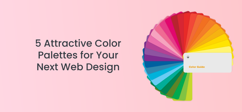
5 Attractive Color Palettes for Your Next Web Design
The following color palettes will give you an idea of what color theory can do for your website. Each of the five palettes is drastically different, showing you visuals that go along with the information you just learned.
1. Peaceful Peach and Purple
The colors in this Peaceful Peach and Purple palette create a calming atmosphere with gentle pops of color.
The cream background is softer than stark white, so the purple and peach look richer as a result. The purple is bright and playful, but you can see how darker hues are links and call-to-action buttons.
This allows the peach to pop and pull your eyes to the important visuals and highlights on the site.
You’re not limited to peach and purple with this palette. You see how the cream background softens the overall look, and the navy blue text provides great contrast and is easy to read. Some of the visual elements include teal and yellow.
These bright colors pull your attention without overpowering the peach and purple.
This palette is ideal for businesses that want to inspire a sense of community between themselves and their audience. The colors create a sense of trust and friendship, showing that this company is reliable.
2. Greyscale With a Twist
The last tip in choosing a color palette was to keep it simple, and this Greyscale With a Twist palette does just that.
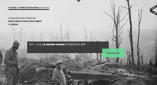
Though it uses black, white, and shades of grey, it’s anything but boring. The simple layout is striking and gives your eyes a chance to take it all in.
Pops of turquoise stand out in stark contrast. This is a great color to use as an accent for links and call-to-action buttons. You can use it at varying levels of opacity, as well, to soften the look.
This color palette is ideal for businesses with a serious reputation.
Museums, educational websites, and financial institutions will appreciate the simplicity and classic look of this palette.
With the ability to add a fun pop of color as a highlight, there’s no limit to how you can customize this look and make it your own.
3. Playful
Greyscale With a Twist is classic and serious, but if you want something bright and fun, the Playful palette is for you.

This palette uses bright colors against a stark white background. Black text ensures your verbiage doesn’t get lost in the visuals.
The primary colors take center stage with this look. Shades of red, yellow, and blue make up the bulk of the imagery, call-to-action-buttons, links, and highlights. They call to mind the company’s logo in the top left corner without detracting from it.
There are also pops of teal and purple to keep this page from having too much primary color on it. Using different shades and opacities of each color keeps it from being overpowering.
The Playful palette is ideal for any business that wants to show they have fun.
The bright colors will draw in your audience, whether you’re selling a product or service or sharing information about your company.
4. Muted Greens
Green is a color with a lot of meanings. It can make you think of life, nature, health, and growth. It can inspire hope, especially when you associate it with money and wealth! Certain shades of green can also call to mind tranquility and harmony.
You can use different hues of green to convey the overall feeling of your business.
The muted greens look more serious than playful on a website, so you know your message is coming across with no fuss.
While this palette is simple, it’s not bland. The cream background softens the muted green even more, whereas a white background would make it stark and harder on the eyes.
The Muted Greens palette is ideal for businesses that want to inspire a sense of trust with their audience.
It shows that you’re serious about your work but also has a personality. Instead of having a stark black and white website, you’re using classy muted greens to show some color without seeming too playful.
5. Trustworthy Blue
Blue can look calm and peaceful, making your audience feel serene and secure when visiting your site.
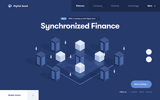
When you use several shades of blue together, as with the Trustworthy Blue palette, you’re showing your customers that you’re a stable and reliable company.
Focusing on just one color doesn’t have to look boring.
The subtle differences in each shade adds depth to the site. The blue background is dark with pops of lighter blue, grey, and white to pull your eye. The tabs are a darker navy, so they stay out of sight until the user needs to engage with them.
This palette is ideal for businesses with serious reputations. It shows that you’re classic, strong, and trustworthy, but you’re not afraid to inject a little color into things.
The shades of blue are a welcome change from stark black and white websites, so your audience will feel serene when they visit.
Key Takeaways
A few key takeaways to remember as you’re choosing attractive color palettes for your next web design include:
- Consider the type of color you choose, such as primary, secondary, and tertiary.
- Look at their placement on the color wheel and see what complementary colors are next to them. Colors across from them will provide a nice contrast.
- Using different shades of the same color gives variation to your site without needing to integrate different colors.
- Use colors from your brand identity, as well as colors that convey the feel of your business.
- When in doubt, keep it simple. Choose strong colors that make a statement and are easy to read on the site.
Final Notes
Understanding the types of colors and what looks good together will help you design an attractive color palette for your next web design.
You can strengthen your brand identity and give customers an idea of what to expect from your business.