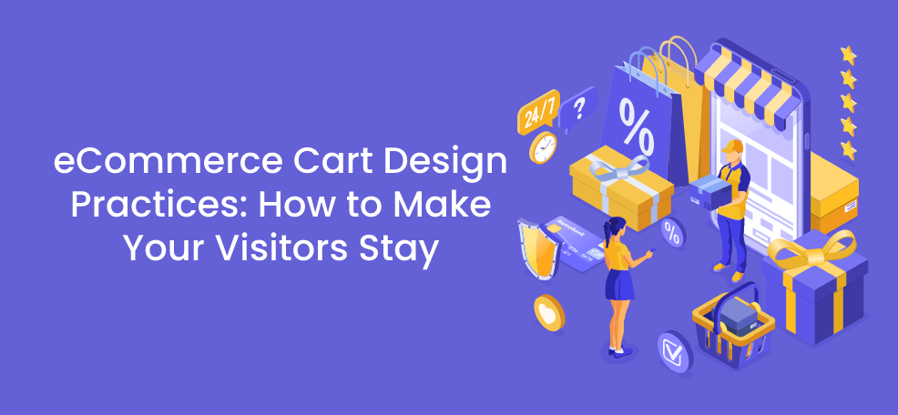
One of the most common issues that eCommerce businesses struggle with is eCommerce cart abandonment. This is supported by the statistics that show the average abandonment rate for online shopping carts is 69.89 percent. If you do not try eCommerce cart design practices and do not learn how to make your visitors stay, you will surely lose many potential buyers.
Due to many issues such as globalization and consumerism, people tend to buy various things even though they really need them or not. With the emergence of the Covid-19 pandemic in 2020, people moved dramatically toward online shopping, which brought an increase in eCommerce revenue. People found online shopping more convenient and safe than ever, which was quite perceptible.
But what if your shopping cart is not efficient enough to convert your generated leads?
Here in this article, we will introduce some of the best eCommerce cart design practices to help you make your visitors stay.
Ecommerce Cart Design Practices: How to Make Your Visitors Stay
Cart abandonment may not seem like a huge concern, but it can cost your business a lot of money. You have made a great effort and devoted lots of energy, time, and money to generate leads and scale your website traffic, but you see many uncompleted shopping carts in the end. As a web designer or eCommerce owner, how do you think you can assist your visitors in repairing this sales funnel leak? Here are 8 places to begin.
1. Add a Shopping Cart Icon to Your Website
It may sound corny that you are an eCommerce business owner but have no shopping cart on your website. The issue of having a shopping cart icon on your website is crucial because it ensures your visitors that they can quickly add desirable items and make a purchase.
Moreover, you should make sure to add the shopping cart icon to a section on your website that is easy to find and easy to see. Obviously, you should add it to the top part of your website. It is your choice to add it either to the right corner or left corner. However, Amazon, the eCommerce king, has placed its shopping cart in the top right part. In fact, many eCommerce websites add their shopping cart in the top right corner.

2. Show the Number of Items on the Icon
It is helpful if you remind your visitors about the number of items they have added to their shopping cart. It is especially significant if you have a “buy 3, get 4” promotion for your eCommerce businesses on a Black Friday, for example.
This number can be helpful to your website visitors or app users in two ways. Firstly, it shows them that the item they have chosen is added to their shopping cart. Secondly, it makes it easy for them to keep track of the number of things they have chosen.
This is how Kiko Milano shows the number of selected items on the shopping cart icon.

3. Display a Confirmation Message When They Add an Item
Design your shopping cart in a way that confirms whenever your visitors add an item to their cart. A confirmation message ensures that they don’t have any doubts about whether or not it worked.
In addition to the number you add to the shopping cart, which guarantees that the item they have chosen is added to the shopping cart, you can also design a confirmation message with the same function. So, when a visitor adds a product to their cart, confirmation prevents them from worrying whether or not it went through.
Your confirmation message may or may not include buttons. You can design it in a way that it consists of two buttons of “Complete Purchase” and “Continue Shopping”. In addition, you can also cross-sell with a display of comparable products at the bottom of your confirmation message, just like what Amazon does.
Kiko Milano is an excellent example of providing a confirmation message:

As you can see, this confirmation message has two buttons of “Continue” and “Go to Cart” for the convenience of the users.
4. Add a Mini Cart
A mini cart is a pop-up that displays the most crucial information about the shopping cart items. It allows clients to have a look without leaving the product page they’re on. So, if they want to check the size they have chosen for the shirt they have added to the shopping cart, they can easily do it without actually leaving the product page and entering the shopping cart page.
With a mini cart, you help visitors see what items they have added to their shopping cart without actually opening their shopping cart page. So, without losing their place on the site, they may check what’s in their shopping cart by clicking or moving the cursor to the shopping cart icon.
This is how Asos uses a mini cart:

As you can see, the mini cart that Asos uses shows the price, name, size, and quantity of the items. If the visitor decides to finish their purchase, they can click on “Buy Now”. They can also “View Cart” for more modifications and completing the purchase. There is also a trash button that users can immediately remove the items they do not want to buy on second thought.
5. Inform if Shipping is Free
The most common reason for individuals abandoning their shopping carts is the high delivery costs. Fortunately, there is a simple solution: provide free delivery on orders exceeding a specific amount and gently encourage your consumers to reach that level.
For instance, Shein encourages its visitors by counting the remaining dollars they should spend on the items to win the free shipping.

6. Add a Checkout CTA
There are a lot of features on the shopping cart page. Customers can view their order, adjust quantities of each item, change colors, remove items, go back to the product page, and so on. However, the shopping cart page’s main aim is to send visitors to the next stage of the sales funnel, which is the purchase completion and checkout.
The checkout button should be the only call to action on your shopping cart page. You can add a different color to the button to make it more prominent. The size should be reasonable as well so that users can see it easily. You can provide other similar product recommendations below the page, but don’t put too much emphasis on them because it will deter consumers from checking out.
7. Use Exit Intent
You can increase your conversion rate and decrease cart abandonment if you could prevent your visitors from leaving by making a last-ditch effort to persuade them to buy. One common strategy is to use exit intent pop-up.
Exit-intent pop-ups help you to make your last effort to maintain your visitors on your shopping cart page. An exit-intent popup is triggered when the mouse pointer moves towards the back button or exit cross on the browser or tab.
By breaking the user’s typical activity pattern, you force them to make a different decision rather than simply clicking on the exit button. You might present an offer or a coupon code in your exit intent pop-up that makes immediate checkout too enticing to pass up.
Look at how SocialPros uses an exit intent pop-up with a promo code for its Instagram growth services:

8. Make Your Shopping Cart Mobile Responsive
Designing your cart for mobile conversions is quite crucial as 55.4% of people worldwide made online purchases on their mobile phones in 2020. If your shopping cart page is not mobile-friendly, there is a high potential that you lose half of your customers-to-be.
To make your shopping cart responsive also for mobile users, keep the following design elements in mind:
- Add buttons that are simple to tap with fingers
- Include forms that are simple to complete
- Break down the checkout procedure into steps
- Add a feature that allows you to save information for later use
- Build a clean and tidy appearance
- Never forget testing
Using e-commerce platforms like Shopify or WooCommerce (plus feature-rich WP builders) could make your life much easier when it comes to responsiveness and mobile. Both platforms come with lots of responsive e-commerce themes, templates, and tools.
Conclusion
Creating a sales funnel that converts is indeed a complicated process for every concerned eCommerce owner. If you have adopted several marketing strategies to attract leads to your business, you already have spent money and time on your marketing strategies. Accordingly, it would be a considerable loss if your shopping cart is not designed well enough to convert your website visitors or app users.
The above tips are the best eCommerce cart design practices that make your visitors stay. Along with a powerful Chat plugin, use them if you do not want to waste your efforts and increase your eCommerce revenue to a greater extent. Wish you the best of luck!
Author’s Bio
I am Parichehr Parsi, a freelance content creator, and link builder. I currently write for Ainfluencer. I love reading, writing, and doing research.