
One of the sectors having robust growth these days is the online business, as in recent times, it has created a revolutionary impact all over the world. The concept of the online delivery business has changed the way people used to do business. In fact, entire retail and small businesses have started taking advantage of the website to run their business online and offer better services to customers.
Staying ahead of competitions is important
As the mobile market is growing rapidly, the same situation is in the business market. The business market is rising, and so are the competitions. The competitiveness in the marketplace forces the business people to remain active in the market by taking some actions to offer the best services to customers.
Looking at the competitions in the online world, business people are focusing on technology and working on it because it directly affects the performance of their business.

The business people running a dedicated online platform need to accurately follow the technological parameters so that their online platforms like mobile apps and websites run smoothly. As the market is growing, the competition is at its peak, and people have more options to choose from. That is why the business people are pushing their web developers to create a customer-friendly online platform to run their venture.
Need for mobile-friendly website
The growth of the internet world has been fascinating in recent times, which has impacted the online business world. Today, there are 4.66 billion internet users, which is almost 60% of the total global population. These are the people that have made online success. The fact here is that more than 90% of internet users are smartphone users, and hence, that is one of the important considerations for online businesses.
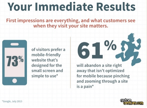
Mobile users are important to target because most of the revenues for online business will be generated from them. Hence, the online delivery business owners need to be concerned about whether their website is mobile-friendly or not because that can really impact their business’s success.
Overview of online delivery business
The online business is trending and one of the hottest marketplace business models these days as the business people are leveraging the power of the mobile-based delivery platforms to offer flexible doorstep delivery and run their venture. The businesses are moving forward with this online delivery concept very well and are able to achieve considerable success. The widespread use of such concepts made the competition high, which needs to be concerned.
After going through all the current scenarios of online business, delivery services, business market, and impact of mobiles, one can understand the importance of mobile-friendly websites. Hence, you need not worry about checking the mobile-friendliness of your online delivery business website because here is the important checklist you need to consider.
First Method: Quick Scan
This is by far the best method for checking the website’s mobile friendliness, and one running the business online can check with this method effectively. It is also known as the 3-second method because one can complete the scan of the mobile-friendliness within 3 seconds. To check the mobile-friendliness of the website, one needs to open the website and drag the entire page with the scroll on the right corner of their screen.
If the scan goes smoothly without any interference, then it is considered mobile-friendly because the users can scroll and navigate the entire online delivery business website smoothly to operate. Hence, it is one of the easiest and quickest methods to check how mobile-friendly their website is for the users.
Second Method: Mobile-Friendly Analyser
If you want to go deep into checking how friendly your website is for mobile users, you can opt for its tools. One of the popular tools of your website is google which does it smoothly and quickly. The googles tool will help you to check within a few seconds, and it will declare the results effectively. Also, it is one of the ideal and essential ways to check and is very reliable. The analyzer will rate the mobile-friendliness of the website by giving a percentage score out of 100.
Google’s website-friendly website rater will mention the following common reasons:
- Content wider than screen: When the content is wider, mobile users won’t be comfortable viewing the site’s content and get frustrated because of unfriendly business sites.
- Links too close together: Links closer and together can be confusing, irrelevant, and not friendly for mobile users, and it will clearly display this reason on your site.
- Small Text: One of the important criteria for the users to engage with your site is its text, and having too small characters may not be readable for the mobile users; hence, it is important to check it for mobile friendliness.
- Mobile viewport: Makes sure people don’t have to rotate their phone to see everything displayed on their website.
The best part of this analyzer is that it gives the reason if your online business website is not mobile-friendly. It clearly describes the reasons why your business website is not friendly so that one can work on that aspect and improve their site and ultimately the business.
Third Method: Deep Test With Google Webmaster Tools
This is one of the deep and accurate tests when it comes to checking the mobile-friendliness of your online delivery business website. The above methods may have some flaws left, and if you are not able to attract mobile users, this is the best method you can use for your site. The best part of this tool is that it is very accurate and hints at some of the common reasons why the website is not mobile-friendly.
The deep test gives the accurate test, and these tools are very reliable and make things easier for business people. The following important consideration will be taken care of by the Google webmaster tools,
- Irrelevant content: Irrelevant content is a mistake that no one can notice, but behind the scene, it is hampering your site and is not friendly for mobile users.
- Faulty redirects: When shopping for the things they would like to purchase, people click on the links but are eventually unable to find the product they require, and that is faulty redirects that need to be solved.
- Mobile 404 Error: 404 errors are frustrating for users, especially mobile users when shopping for things. Also, it creates a bad impression for your online delivery site, and these webmaster tools help in finding these problems and resolving to make your site mobile-friendly.
- Irrelevant cross-links: Cross-links can really create chaos in your website, and irrelevant and excessive link exchange can be confusing for your delivery site to rank. Also, it is not considered mobile-friendly.
- Slow mobile pages: Mobile users are always looking for a seamless experience and want everything at their fingertips. Hence, there is no room for slow mobile pages because that is annoying for the users. The webmaster detects slow mobile pages and helps in optimizing for better performance.
Consider Responsive Design For Better Performance
The latest generation technology helps create the responsive design for the site, which is the practice that needs to be followed for better performance. Design is one of the critical aspects when it comes to mobile-friendly websites. Most business people also use plugins for great UX which is very useful.
The delivery business website consists of many products and categories, which is why the UI/UX design plays one of the vital and critical roles in improving the website’s mobile friendliness.
The products and categories are mentioned with accurate design so that the customers won’t face any dilemma in navigating the wide range of the products. The eCommerce metrics and mobile shoppers are increasing day by day, which is why responsive mobile design is important to consider.
Why is Mobile-Friendly Website Important Specifically for Delivery Business?

The rise of the online market is what everyone is witnessing these days, but at the same time, the increase in smartphone users needs to be considered, especially for business owners. Mobile users are increasing, and the majority of the revenues come from them. The delivery business is something that serves the day-to-day household services.
Smartphones have played a vital role in increasing the popularity of the online business. Whether it is using credit cards and making hassle-free payments or ordering things, smartphones have been the biggest help for human beings in modern times. Hence, considering the immense popularity of mobile users, the need for mobile-friendly websites for delivery business is obvious.
Final Words
The more you optimize your website and learn the process, the more mobile-friendly your website will remain to offer excellent services to users. A business running with an online platform like a website needs to be mobile-friendly. That is why we have discussed the importance, ways, and much more about the mobile-friendly website for the online delivery business.
Author’s Bio
Nirav Parmar is an online marketer and blogger having hands-on experience in crafting creative content. The skills he poses in creative writing are fantastic as his ability to write engaging content attracts the readers.